
An Aggressively Complete Guide to File Types
So I just sent you your branding files (HOORAY!) and have successfully confused the sh*t out of you with the sheer number of files you’ve received. There’s no need to be an expert on these but file types are important! And can mean the difference between a pixelated logo and a sharp one. So let’s learn a bit, shall we?
First, it’ll help to understand 1 basic concept: vector vs. raster.
Vector vs. Raster
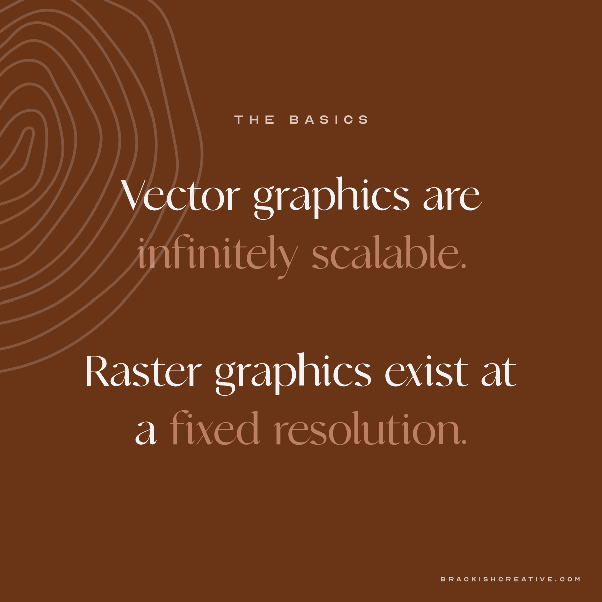
A vector image is comprised of paths, or a combination of points and lines.
All you really need to understand from this is that vector graphics are infinitely scalable. You can put them on the side of a building just as easily as an icon on your website and not lose quality. Also, because they’re made up of lines, you can cut right along them to make a shape (storefront signage!).
A raster image is comprised of pixels.
These images are created or taken at a fixed resolution, which means that you can only scale them up to a certain point before you lose quality. You probably know pixels. It’s all those little squares that you see when you zoom in WAY too far on an image. These are stuck in their boxes. To explain this simply, if you have an image that is 10px by 10px, you will only have 100 boxes to fill, no matter how big or small you make the image.
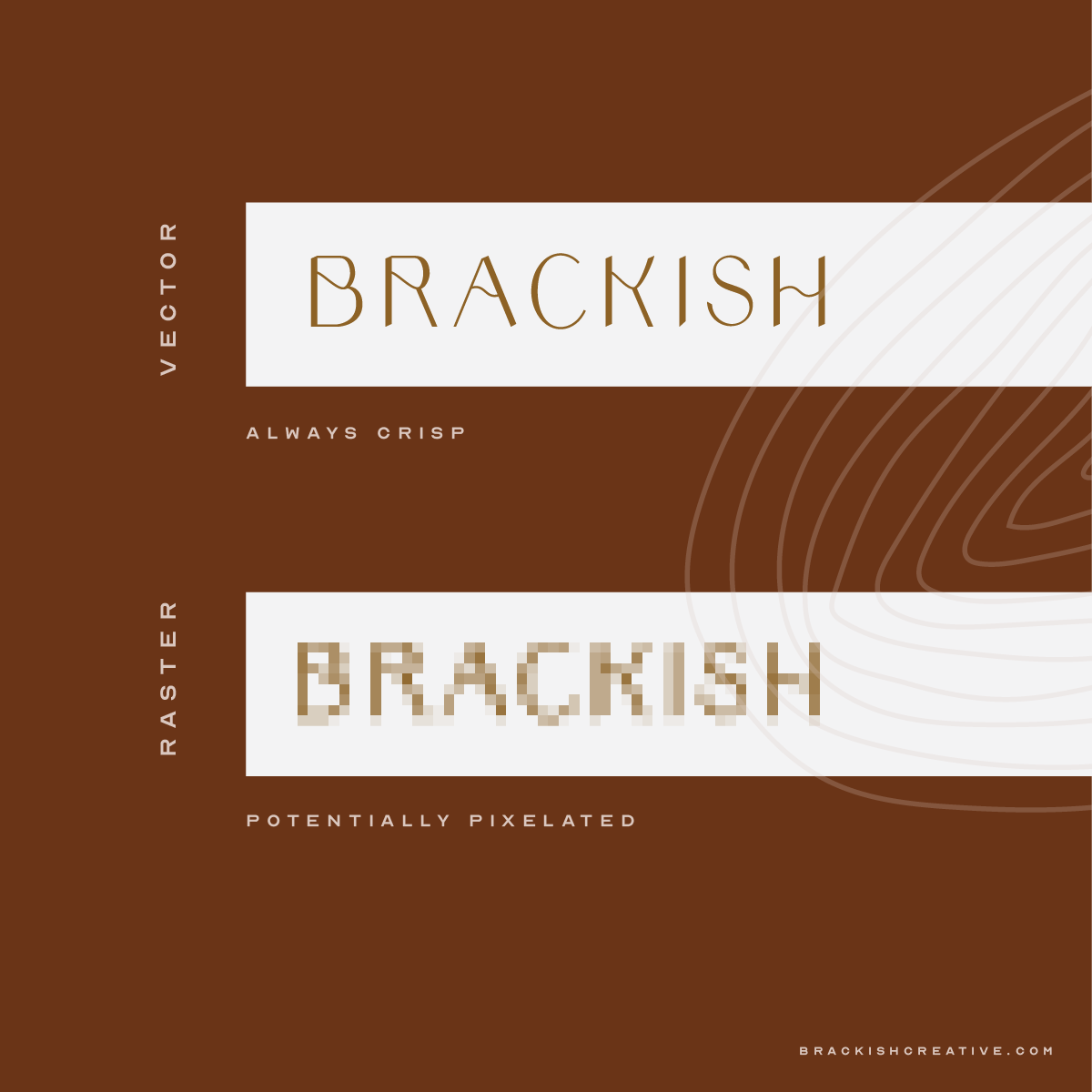
As you can assume, vector files are preferred for most logo usage because they’ll always look sharp. But there are some instances where using a raster logo is just fine!
Let’s take a look at the differences.
EPS
Technically, EPS files can be vector or raster or a combination of both. But for this purpose (and how I use them), let’s assume they’re vector-based. EPS files can be opened in almost any software that supports vectors - which is useful if you’re providing a file to someone who may not be using Adobe Illustrator. It’s the preferred file type for logos and any designer worth their salt is going to give you one, please and thank you.
Use it when: you send files to a designer or need a vector file.
AI
AI files are native Adobe Illustrator files. They can contain a single artboard (or page) with 1 element or can hold a collection of assets. It’s a design industry standard but you probably won’t be using these a lot or at all, unless you have a designer on your team.
Use it when: you send files to a designer.
PDFs have so many uses it’s hard to know where to begin. They can carry full layout booklets for magazines, lookbooks, etc. But they can also hold vector images similar to an EPS. The main difference here is PDFs can be viewed by anyone in Adobe Reader, Acrobat, or Preview (Macs). I use PDFs as a means to send vector logos as well as proofs.
You can also control compression (image quality) for a PDF without modifying the original file type, which is why they’re great for proofs and why sometimes your proofs will appear low-resolution but final artwork will not.. If you need a print file for your logo, use a PDF!
Use it when: you need to print a logo.
PNG
PNG stands for Portable Network Graphic. Think of them like a JPG but with 2 very important distinctions: First, PNGs can only be saved in RGB color space. They’re primarily meant for web use but if you’re not worried about color accuracy (especially with black/white), you can use them for print. Second, they allow for transparency! This is wonderful news for when you don’t want your logo to have a white box around it and need to put it on a variety of backgrounds.
Use it when: you need a transparent background (and don’t have the option to use a vector-based graphic).
JPG
JPG (or JPEG) stands for Joint Photographic Experts Group, if you’re a nerd and are loving this stuff. They’re the most commonly-used file type for photographs because they do a great job at compressing data into a smaller file type. They are “lossy”, which just means that they will lose quality. Typically, a designer or photographer will specify a standard amount of “loss” for each use, so you don’t have to worry about that. They can be saved in RGB or CMYK color spaces and you will see the difference between the two, trust me.
I give my clients JPGs but as a general rule, I recommend using PNGs for web use and PDFs for print.
Use it when: you need a last resort.
Honorable mentions:
SVG
An SVG is a scalable vector graphic! I want to say it technically only supports vectors, but I had someone send me a JPG embedded in an SVG recently and it really had me shaken up. SVG and EPS are pretty standard for vector graphics, regardless, but SVGs are a web-based standard for vector graphics.
GIF
I don’t have a lot to say about these guys as likely the only time you’ll realistically run across them is to send a real good meme. They allow for multi-frame exports, which is a cool usage! PNGs have primarily replaced these guys in static uses but worth an honorable mention.
TIF/TFF
Think about TIF/TIFFs as a JPG without any loss. If you get a TIFF file, it should be the highest-possible resolution of a photograph. Still uses pixels, still good for photos, however it doesn’t degrade in quality like JPGs do.
PS, INDD, AI
If you get a file with any of these extensions, they’re Adobe Creative Cloud file types. They can all contain multiple pages, layers, color systems, and lots more. If you get these file types from a designer for any reason, I would tuck them away as a “just in case a vendor/designer/etc. needs them” unless you know what you’re doing. I just included them as an FYI!

A word on color systems:
In your brand package, you’ve received some color codes. Among these might be Pantone colors, hex codes, CMYK and RGB values. There’s a lot to go into here but I’ll keep it simple.
Pantone colors: A lot of brands use PMS (Pantone Matching System) colors because you can get an exact match every time. I use them wherever possible because they take a lot of the guesswork out when I’m switching programs. While meant for print, the color translation on web is really good so never a bad option.
Hex codes are mostly used in web programs. They’re also a fixed value. I typically apply hex codes to my Pantone colors.
CMYK is a subtractive color system: what your typical printer uses. CMYK stands for the 4 ink cartridges that are used to make up all colors: cyan, magenta, yellow, and key (black). You’ll get CMYK values from 0-100 to make up every color. CMYK reads can be finicky and I hate them but they’re necessary for most printing.

RGB is the display-safe version of CMYK, in short. Whereas CMYK is a subtractive color system, RGB is an additive one. I could nerd out on you here but it just has to do with the way light works to make colors, whether that’s transmitted or reflected. RGB stands for red, green, and blue and you’re given values from 0-255 to make up every color. Again, it can be a little finicky.